Examples
To start things off, import a few basic
tools, including bayspar:
In [1]: import numpy as np

In [2]: import matplotlib.pyplot as plt

In [3]: import bayspar as bsr
There are a few options when it comes to prediction with bayspar.
Below, we use example data - included with the package - to walk through each
type of prediction.
Standard prediction
We can access the example data with get_example_data() and use the
returned stream with pandas.read_csv() or numpy.genfromtxt():
In [4]: example_file = bsr.get_example_data('castaneda2010.csv')

In [5]: d = np.genfromtxt(example_file, delimiter=',', names=True)
This dataset (from Castañeda et al. 2010) has two columns giving sediment age (calendar years BP) and TEX86.
In [6]: d['age'][:5]
Out[6]: array([142., 284., 375., 466., 558.])
In [7]: d['tex86'][:5]
����������������������������������������������Out[7]: array([0.662, 0.662, 0.652, 0.66 , 0.664])
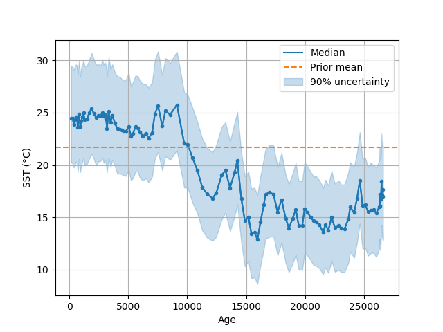
We can make a “standard” prediction of sea-surface temperature (SST) with predict_seatemp():
In [8]: prediction = bsr.predict_seatemp(d['tex86'], lon=34.0733, lat=31.6517,
   ...:                                  prior_std=6, temptype='sst')
   ...:
The TEX86 data and site position are passed to the prediction
function. We also give standard deviation for the prior
SST distribution and specify that SST are
the target variable. A Prediction instance is returned,
which we can poked and prod with direct queries or using a few built-in
functions:
In [9]: bsr.predictplot(prediction)
Out[9]: <matplotlib.axes._subplots.AxesSubplot at 0x7fe4e48c1940>
You might have noticed that predictplot() returns an
matplotlib.Axes instance. This means we can catch it and then
modify the plot as needed:
In [10]: ax = bsr.predictplot(prediction, x=d['age'], xlabel='Age',
   ....:                      ylabel='SST (°C)')
   ....:

In [11]: ax.grid()

In [12]: ax.legend()
Out[12]: <matplotlib.legend.Legend at 0x7fe4e41adc50>
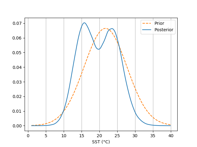
In much the same way, we can view the distribution of the prediction prior and posterior with densityplot():
In [13]: ax = bsr.densityplot(prediction,
   ....:                      x=np.arange(1, 40, 0.1),
   ....:                      xlabel='SST (°C)')
   ....:

In [14]: ax.grid(axis='x')

In [15]: ax.legend()
Out[15]: <matplotlib.legend.Legend at 0x7fe4e417c908>
We can access the full prediction ensemble with:
In [16]: prediction.ensemble
Out[16]:
array([[21.91805914, 24.62916528, 28.57951152, ..., 26.52595937,
        21.94440861, 24.79127837],
       [26.49763293, 20.55542482, 30.98907914, ..., 26.37460037,
        27.5468752 , 20.62028092],
       [22.56615876, 27.11827498, 29.76786586, ..., 27.78142722,
        21.30503688, 24.67098731],
       ...,
       [16.46016389, 16.74438454, 15.19909547, ..., 15.66276759,
        19.3195208 ,  7.19166657],
       [17.54578879, 19.8666101 , 19.4892547 , ..., 19.39896041,
        19.1839499 , 18.66330882],
       [15.95462367, 14.34443438, 22.87645215, ..., 19.60524116,
        16.01702683, 19.00085086]])
A useful summary is available using:
In [17]: prediction.percentile()[:10]  # Showing only the first few values.
Out[17]:
array([[20.23779846, 24.4884523 , 29.45734614],
       [20.14348693, 24.45662889, 29.39588029],
       [19.75914219, 23.90553278, 29.04305361],
       [19.94600303, 24.3526486 , 29.43161355],
       [20.31047935, 24.58148811, 29.60220011],
       [20.18308107, 24.44233438, 29.52972341],
       [19.33064405, 23.62777045, 28.72031132],
       [20.57624226, 24.89161967, 30.00984215],
       [19.31528178, 23.65094419, 28.50935295],
       [19.93478766, 24.22360018, 29.31318249]])
See the percentile() method for more options.
Analog prediction
Begin by loading data for a “Deep-Time” analog prediction:
In [18]: example_file = bsr.get_example_data('wilsonlake.csv')

In [19]: d = np.genfromtxt(example_file, delimiter=',', names=True)
This dataset is a TEX86 record from record from Wilson Lake, New Jersey (Zachos et al. 2006). The file has two columns giving depth (m) and TEX86:
In [20]: d['depth'][:5]
Out[20]: array([91.51, 92.95, 93.83, 95.96, 96.94])
In [21]: d['tex86'][:5]
����������������������������������������������������Out[21]: array([0.79, 0.74, 0.77, 0.7 , 0.87])
We can run the analog prediction of SST with predict_seatemp_analog():
In [22]: search_tolerance = np.std(d['tex86'], ddof=1) * 2

In [23]: prediction = bsr.predict_seatemp_analog(d['tex86'], temptype='sst',
   ....:                                         prior_mean=30, prior_std=20,
   ....:                                         search_tol=search_tolerance,
   ....:                                         nens=500)
   ....:
A Prediction instance is returned from the function. The arguments that we pass to the function indicate that the calibration is for SST. We also indicate a prior mean and standard deviation for the sea temperature inference. Note that we pass a search tolerance used to find analogous conditions across the global TEX86 dataset. The nens argument is to reduce the size of the model parameter ensemble used for the inference - we’re using this option because otherwise this page of documentation would take too long to compile. This argument isn’t required if you’re following along with these examples on your own machine. By default, a progress bar is printed to the screen. This is an optional feature that can be switched off, for example, if you are processing many cores in batch.
Note
Analog predictions can be slow to calculate if many analog are selected. Be careful not to select too large a value for search_tol.
Specifically, for analog predictions, we can map the information used for the inference with analogmap():
In [24]: paleo_location = (38.2, -56.7)

In [25]: ax = bsr.analogmap(prediction, latlon=paleo_location)

In [26]: ax.legend()
Out[26]: <matplotlib.legend.Legend at 0x7fe4e4114da0>
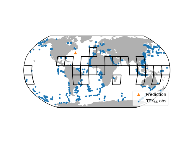
This maps the location of all available TEX86 observations. We passed an optional paleo-location of the site to the mapping function. The map also indicates the grids that were identified as analogs for the prediction.
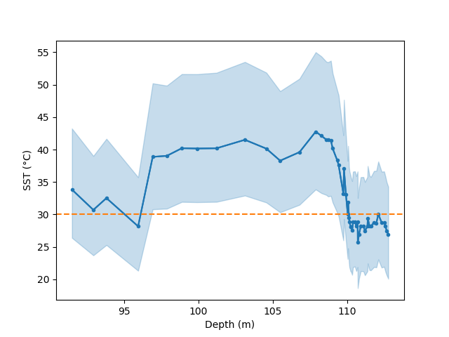
We can also examine our prediction as though it were a standard prediction. For example, we can plot a time series of the prediction:
In [27]: bsr.predictplot(prediction, x=d['depth'], xlabel='Depth (m)',
   ....:                 ylabel='SST (°C)')
   ....:
Out[27]: <matplotlib.axes._subplots.AxesSubplot at 0x7fe4e416e2b0>
Forward prediction
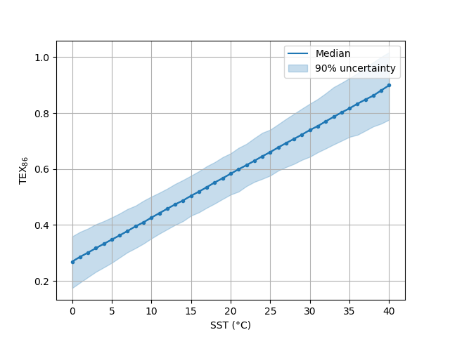
For this example, we make inferences about TEX86 from SST data using a forward-model prediction. We start by creating a SST series spanning from 0 - 40 °C:
In [28]: sst = np.arange(0, 41)
And now plug the SST data into predict_tex() along with additional information.
In this case we’re using the same site location as in Standard prediction:
In [29]: prediction = bsr.predict_tex(sst, lon=34.0733, lat=31.6517, temptype='sst')
As might be expected, we can use the output of the forward prediction to parse and plot:
In [30]: ax = bsr.predictplot(prediction, x=sst,
   ....:                      xlabel='SST (°C)',
   ....:                      ylabel=r'TEX$_{86}$')
   ....:

In [31]: ax.grid()

In [32]: ax.legend()
Out[32]: <matplotlib.legend.Legend at 0x7fe4e406d048>